How to Make an Airplane-Fish
Fins and Passports Visual Identity
Client: Fins and Passports
Role: Visual Identity Designer
Two close friends decided they were leaving their jobs to be a travel blogging couple. They had fallen in love with scuba diving and wanted to focus their videos on underwater adventures. Brenda and Chris came to me with the name “Fins and Passports” for a visual identity that would reflect those two essential elements of their new life.
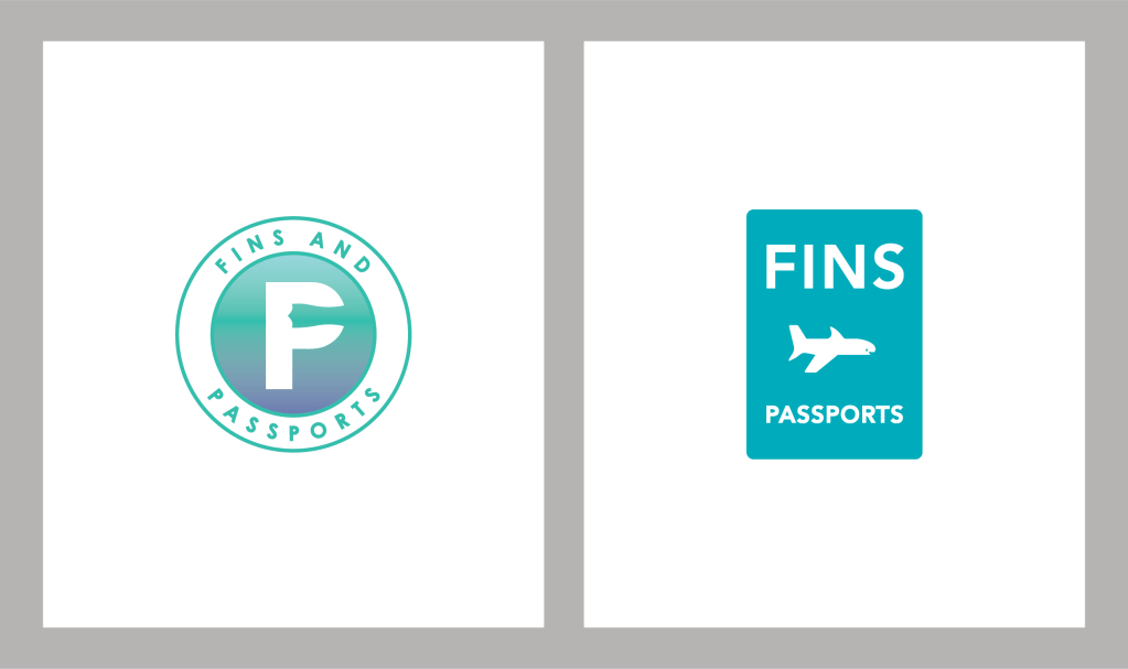
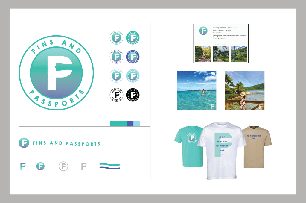
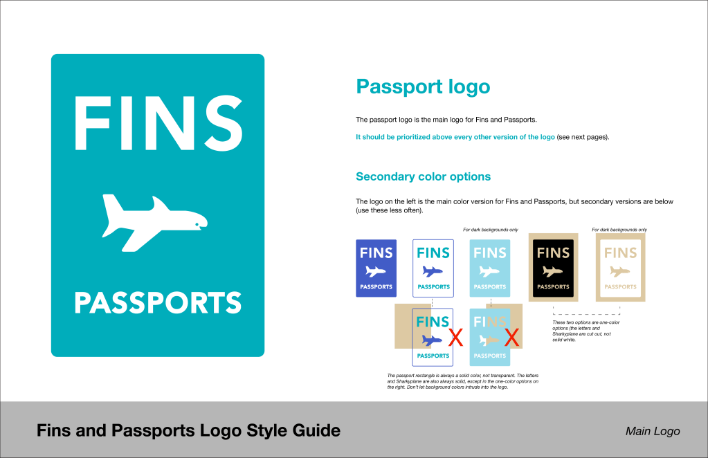
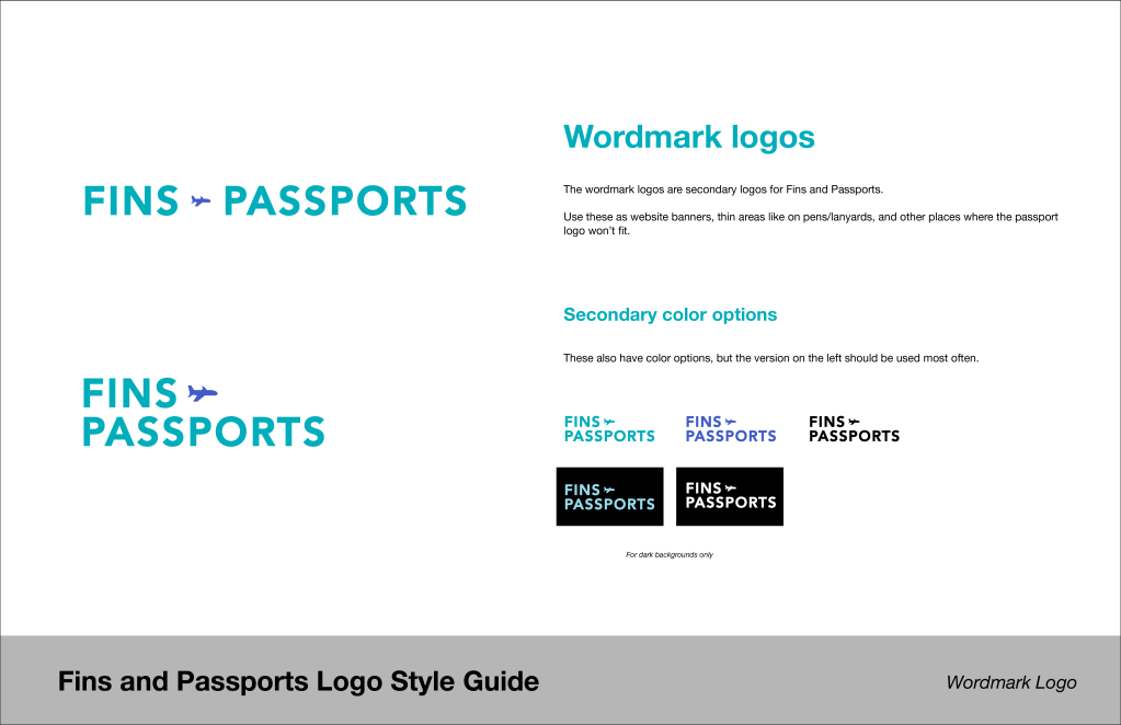
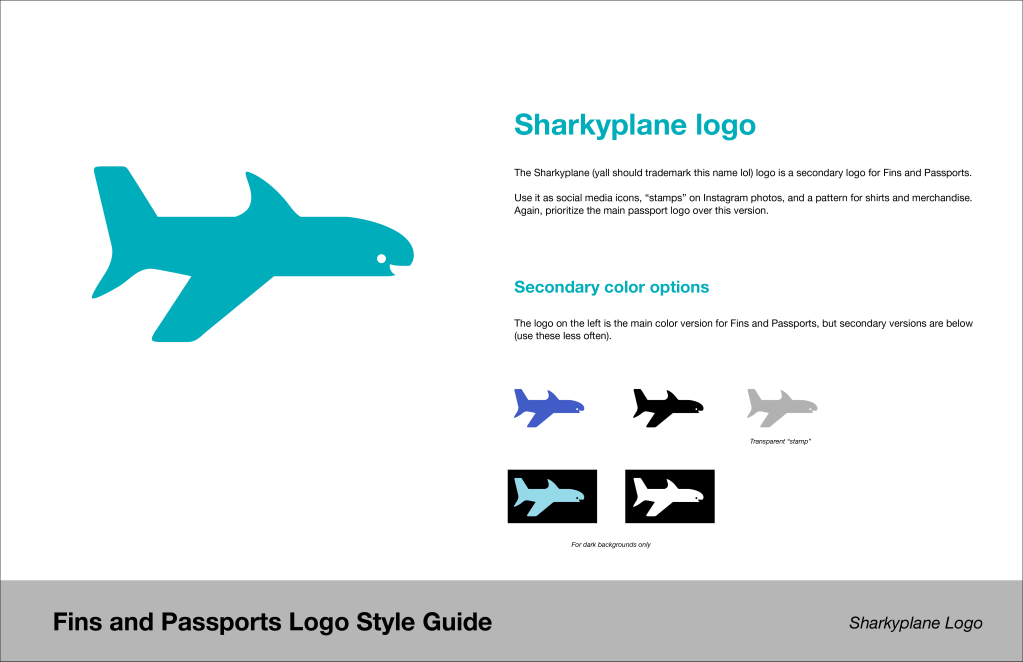
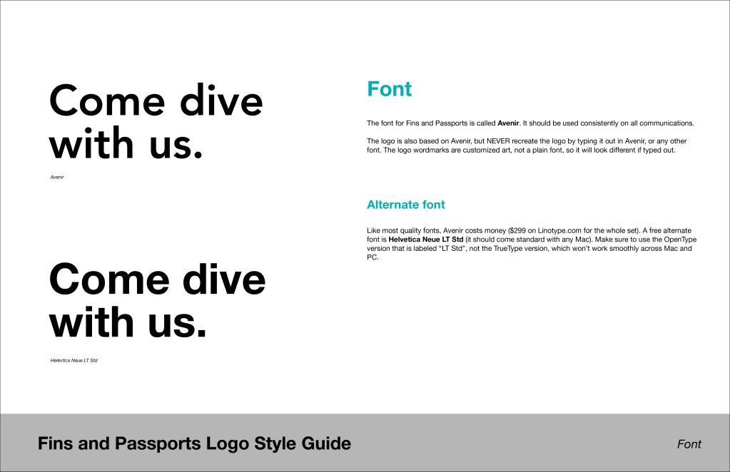
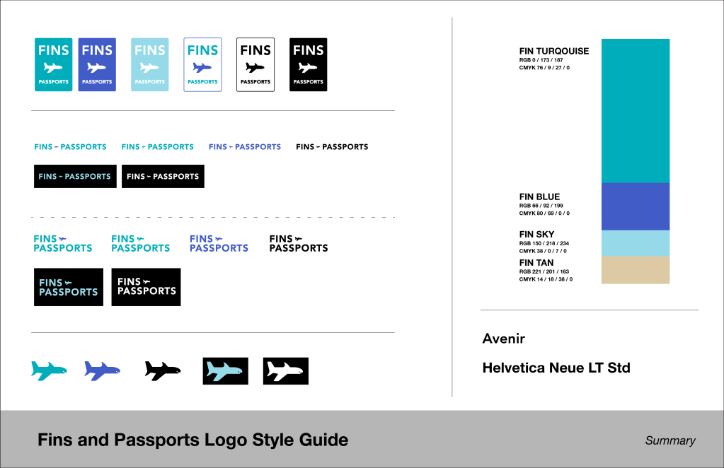
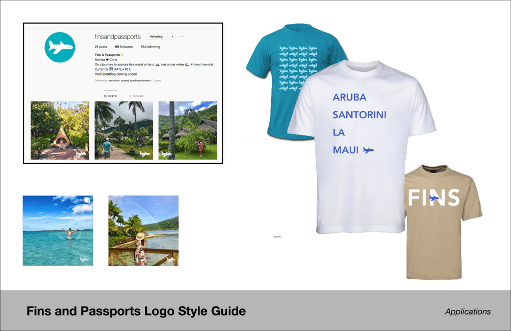
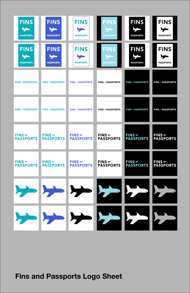
I presented two options. A more traditional logo that interpreted the main marks as both an “F” and a “P, and a slightly more daring option that combined a shark and an airplane as the main mark and encased it in a long, rectangular passport shape. To help them decide, I created a usage guide comparing the two concepts .

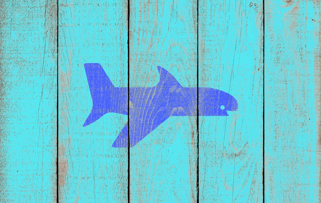
Brenda and Chris eventually settled on the passport option. I was glad they did – I think it sets them apart from other bloggers and can help them become a recognizable brand more quickly.

You can follow Brenda and Chris on Facebook.