How to Clean Up a Brand
UGA Brand Site Redesign
Client: University of Georgia Marketing & Communications
Role: UX Designer, Graphic Designer, Writer (Visual Style and Logos sections)
Writers: Aaron Hale, Kalena Stull
When UGA rolled out its new brand and visual identity in September of 2016, everything was moving fast. Logo files, meetings with deans and alumni, training sessions, and a brand website were just a few of the things our team was managing. Because everyone was scrambling to create a new university-wide system that would hopefully last decades, there wasn’t enough time to carefully curate and design the website that would house all of this information that campus communicators would need. And as the brand evolved over the first few years, some information in it became outdated. In the spring of 2018 our writing and creative teams came together to do a full redesign.
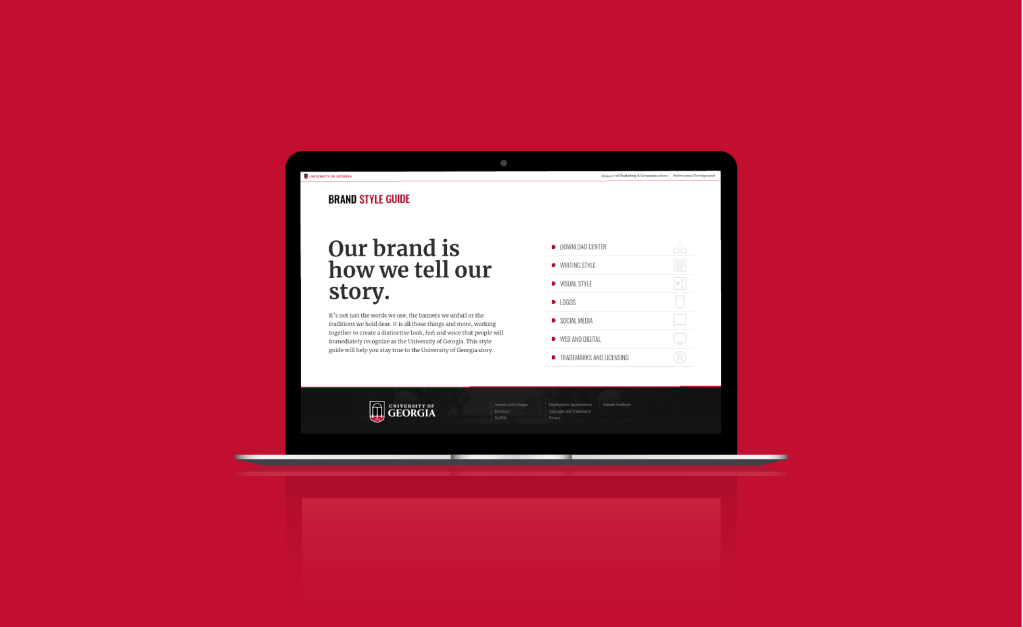
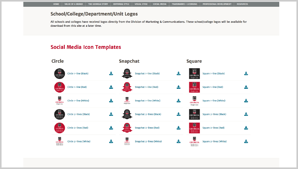
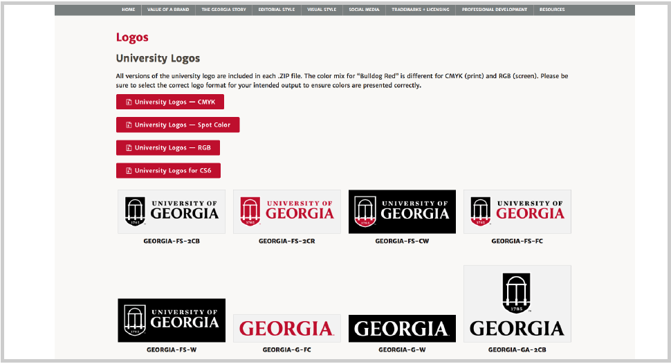
I began by auditing what was then the current site. Nine main pages branched out into forty or fifty sub-pages, and it was very difficult for campus communicators and media to find the resources or information they needed unless they knew exactly what they were looking for.
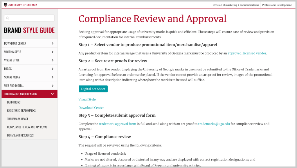
For example, the “Trademarks & Licensing” section, which contained important legal information about using UGA logos, had several sub-pages within it. The trademark approval form was on one page, and the list of trademarks was buried in the contents of another. With so many pages and a menu that remained collapsed at the top of each, the site was confusing to navigate.
Much of the content on the site was stacked vertically in a single column. While okay for mobile, this resulted in a lot of scrolling and hard-to-read chunks of information for desktop users. Paragraphs were averaging over twenty words per line on my monitor (which is about 24 inches wide).
Working with our web developer to understand the constraints, I came up with four goals for the new brand site.
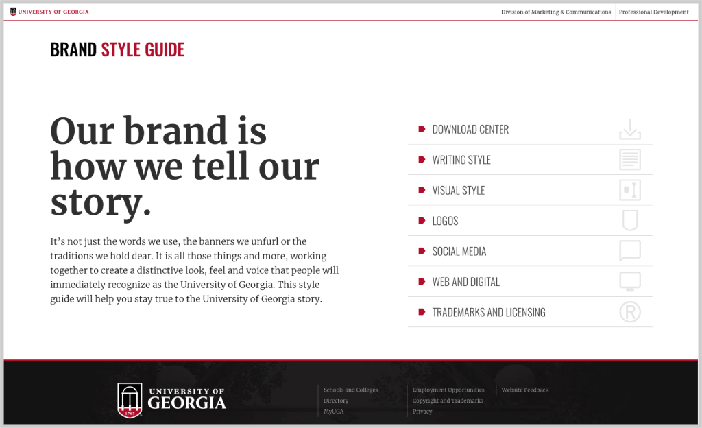
1. Eliminate sub-pages and consolidate the site into seven main pages. This would make it easier to find content.
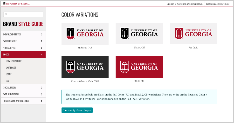
2. Create a side-bar navigation with collapsible sub-SECTIONS (not sub-pages). This would also make it easier to find certain information, as well as offset the search engine optimization issue that could arise from consolidating so many pages.
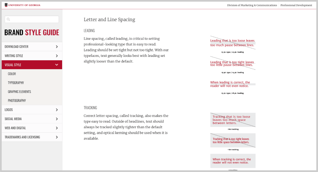
3. Use a two-column structure to juxtapose content and images for easier consumption on desktop.
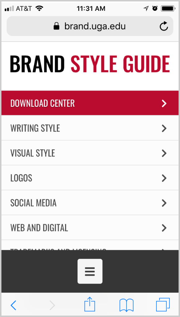
4. Create a hamburger menu for mobile to reduce scrolling.

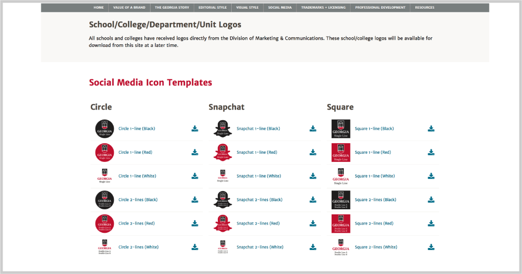
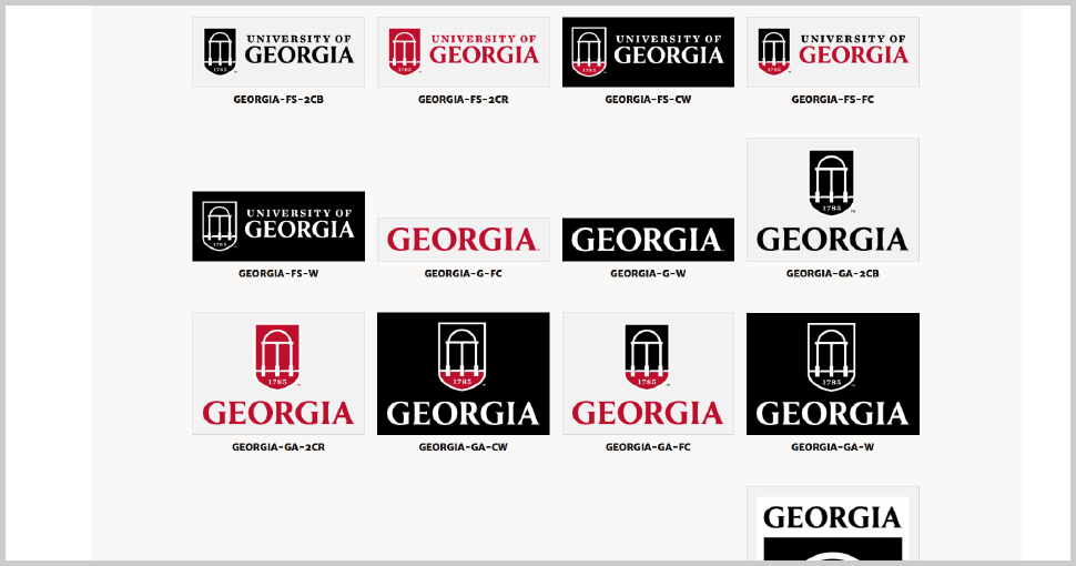
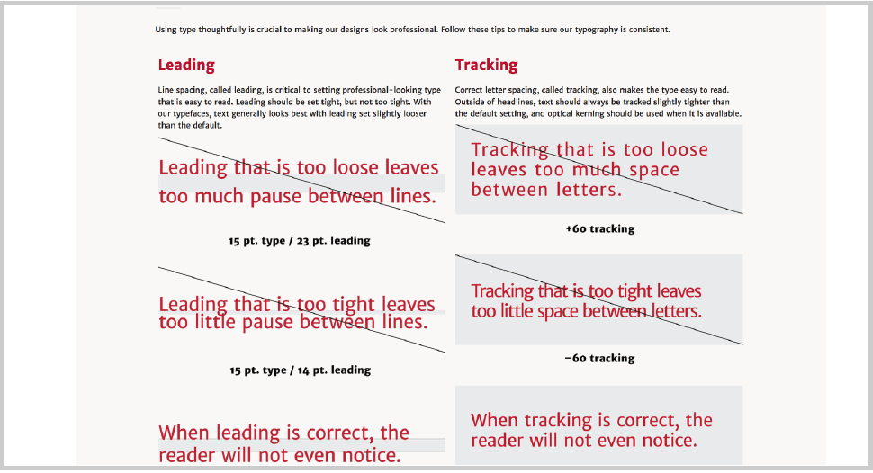



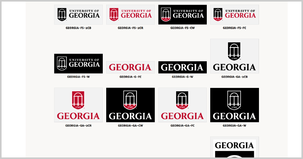



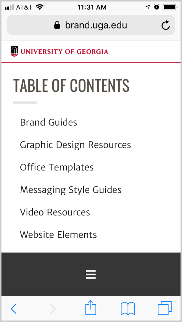

In addition to structuring and designing the site, I also edited the contents for the Visual Identity and Logos pages. At this point, I had gained about two years of experience working with a new logo system and the people who needed to use it, and had continued to improve and clarify the visual identity guidelines. I also added an FAQ section at the end of the Logos page, something we use regularly when campus communicators have questions about how to use UGA’s trademarks. The site was launched in Fall of 2018 and can be viewed here.